Opening Windows 8: Rethinking the missing Start menu
Rich Fiscus
2 Nov 2012 2:55

You may not realize that Microsoft has actually been a proponent of the tablet PC for more than a decade. In fact as early as 2002 they were releasing a tablet PC version of Windows. For numerous reasons previous generations of the Windows tablet PC simply didn't work for most people. The interface wasn't particularly tablet friendly, the operating system was too power hungry, and PC hardware really wasn't suitable in a variety of ways.
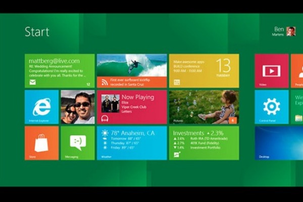
The new Windows 8 tablets and hybrids really do address almost every problem with those previous attempts. A large part of that is the new modern UI (aka the UI previously known as Metro) which uses tiles which roughly combine the functionality of both regular icon shortcuts and widgets found in the Android interface. But because Windows 8 is still a PC operating system it still has all the features you typically associate with Windows, most of which were typically accessed through the Start menu.
There again Microsoft has done a pretty good job of making those features and settings accessible via a tablet's touch interface. Some of them, like program shortcuts, are simply added to the Start screen which is the modern UI equivalent to the desktop. Others are accessed using gestures which basically means swiping from the right side of the screen toward the middle to bring up the Charms bar.
But most Windows users don't have tablets
If you are going to be running Windows 8 on a tablet all of that works pretty nicely but what about a desktop or laptop where you are using a mouse and keyboard rather than a touchscreen? Even if you haven't tried out Windows 8 for yourself you have almost certainly seen the overwhelmingly negative reaction to the changes they made to the traditional desktop interface. Specifically most of the complaints are about Microsoft's decision to remove the Start menu.
The issue isn't necessarily the Start menu itself. In more than a decade of the Start menu's existence it has become home for so many different settings and tools that sometimes it can be difficult for even a long time Windows power user to remember exactly where to find a particular option. But the solution, in this case, seems to create more problems than it solves. If you haven't already experienced the changes for yourself this video details the new locations for everything that used to be found on the Start menu. It's a little long because there are lots of things to find.
As you can see in the video the bigger issue isn't losing the Start menu so much as Windows' new split personality. It simply doesn't make sense for someone who primarily (or exclusively) uses the desktop interface to be transported to the Start screen to access basic Windows functions. For example, if you're trying to find a standard built-in Windows program like Notepad you have two choices. Either you switch to the Start screen, change the view to show all the program shortcuts and then click on the Notepad tile or you can use Search from the Charms bar and Windows will drag you to the Start screen automatically. Either way it's more work than just using the old Start menu.
An opening for third party developers
As frustrating as this is it's not necessarily a reason to avoid Windows 8. If anything it may ultimately lead to the Windows desktop getting the same kind of attention so many other aspects of Windows have. There is already both free and commercial software capable of filling this niche, such as Classic Shell and Start8. In the next couple days each of those programs we will be providing more details about each of those programs.
What's even more exciting, though, is the thought that the millions of Windows users and developers around the world now have an incentive to go even further with their customizations. We already see this in the Linux world where pretty much every part of the GUI can be customized. Work on a port of KDE,
Considering the multitude of different ways Windows, or any modern OS, is used, having a single user interface for everything seems to make less sense today than every before. In fact one of Microsoft's primary goals over the last decade has been to reshape Windows to use a more UNIX-like model where various features, most notably the GUI, are entirely optional. In fact running Windows without the GUI, one of the top requests from Windows system administrators for years, was one of the primary reasons for this change in design philosophy.
These changes may not have been intended to loosen Microsoft's control over the interface, but it seems only natural that's exactly what would happen eventually. And even though it's probably the last thing Microsoft executives would like to see, it's probably a necessary development if Windows is going to remain relevant going forward. The more things people expect their computers to do, the less sense it makes for everyone to use a single user interface. And yet (despite technically using two different UIs) that's exactly what Windows 8 still has.
The more things a PC is expected to do, the less likely it is that any particular Windows user needs to do all of them. Some people will only need the modern UI. Others only need the desktop. For still others neither is particularly useful. Most people have long since rejected the idea that Microsoft should decide what their applications can do. Why not demand the same level of independence for the UI?
Not only does thinking in those terms open up a world of possibilities for the PC, it makes Windows 8 a lot more appealing even if the user interface isn't exactly what you're used to or even what you want or need.
