Sling TV announces UI update for Xbox One
Andre Yoskowitz
25 Sep 2015 21:20

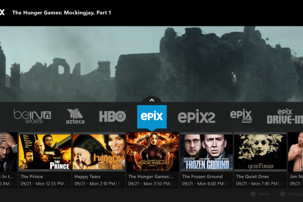
Sling has announced that it will soon be updating its UI for the Xbox One, adding better functionality.
The overall user interface will remain the same, but Sling says there are a ton of bug fixes, and streaming quality has been improved significantly.
Additionally, you can now see the full schedule for any channel you have, as well as video-on-demand content for the channel all in one place.
Of lesser note, searching now uses the "Y" button for the Xbox just like nearly every other app does.
Read the full changes here: Sling
