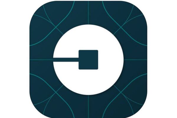
Out of the blue: Uber changes logo and branding
Andre Yoskowitz
2 Feb 2016 22:15

Seemingly overnight, Uber has changed their entire branding, including their logo.
Uber CEO Travis Kalanick made the announcement today with a large blog post, which I have posted here:
Have you ever looked at someone's hairstyle and thought "oh my, you peaked in the 1990s?" Well that's a bit how I feel about Uber's look today. It's not just that we were young and in a hurry when we replaced our red magnet logo with today's black badge four years ago. It's that we were a fundamentally different company.
Uber began life as a black car service for 100 friends in San Francisco--everyone's private driver. Today, we're a transportation network spanning 400 cities in 68 countries that delivers food and packages, as well as people, all at the push of a button. And thanks to services like uberX and uberPOOL we've gone from a luxury, to an affordable luxury, to an everyday transportation option for millions of people.
This change didn't happen overnight, but it sure feels like it did. Almost two years ago Shalin Amin and I started a journey to refresh how Uber looked so it could better represent what we were going to become. The unique aspect of Uber is that we exist in the physical world. When you push a button on your phone, a car moves across the city and appears where you are. We exist in the place where bits and atoms come together. That is Uber. We are not just technology but technology that moves cities and their citizens.
So today, we're excited to roll out a new look and feel that celebrates our technology, as well as the cities we serve.
The Logotype
The first thing you'll notice is that our logotype is at once more grounded and elevated. Some might say it's less fussy (in part because we have cut the curls, our 1990s hairstyle). This will help you see Uber from afar, and when it's in small places. It also reflects a more substantial look as we too have matured as a company.
The Bit
We've also introduced the concept of the bit throughout our design framework. This will put our technology front and center, as well as provide consistency, highlight information and make our brand easy to recognize. Here are some examples from our web site, and it's at the heart of our new app icon as you can see below.
A new app icon
One of the big changes over the years is that Uber no longer moves just people; we're now moving food, goods, and soon maybe much more. With the potential for many apps with many app icons, we needed one approach that connected them all. So we came back to our story of bits and atoms. You'll see that both rider and driver icons have the bit at the center, and then the local colors and patterns in the background. This is a framework that will also make it easy to develop different icons for new products over time.
We approve.