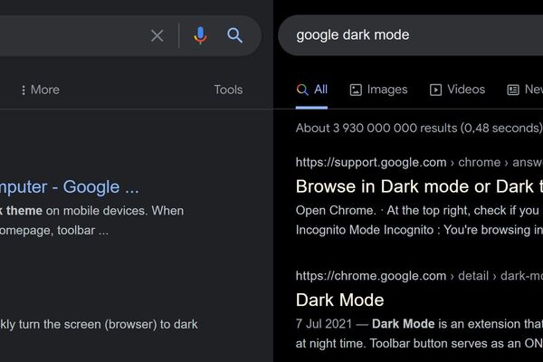
Google testing new dark mode: yellow links, actual black background
Petteri Pyyny
19 Feb 2022 10:57

Google's search results page is arguably the most visited webpage in the world. Due its huge popularity and instant recognition value, Google has been reluctant to change its core appearance. Most of the visual elements of the results page have remained intact for more than two decades.
But as we found out recently, Google is now conducting a limited test on handful of users that would change one very specific thing on its search results page: the link colors.
Company has kept the results' colors in "standard webpage blue" since the searvh itself was launched, back in 1990s.
But with the new limited dark mode test, Google has changed the link color for results from that good olde blue to pale yellow.
Google seems to be testing a new color scheme for its dark mode search results. Links are now yellow-ish and the background is completely black.
-- Petteri Pyyny (@pyyny) February 18, 2022
I get the new(?) colors when logged in to G and using Edge and also w/ incognito Chrome, but not on anything else. #serp #seo #google pic.twitter.com/OzD5nxe69V
Additionally, the new test version dark mode uses completely black background; the widely used dark mode version has "very dark gray" instead of real black as its background.
The change makes sense, as OLED displays become more popular even on desktop PCs. If the pixel is completely black, OLED display keeps that pixel totally switched off - thus, saving energy. But if the pixel is somewhat colored, even with very dark gray, the pixel has to be lit. So, a dark mode that is completely black§ saves energy for users using OLED or AMOLED displays.
And that might explain the trial, too: blue links on black background areb't as readable as yellow ones are. Actually, back in 1970s, when most computers had black background, most computer terminals used either green or yellow text in order to make them more readable.
In our tests, the new yellow/black Google version appeared only on one Windows 10 PC. On that PC, the new design popped up with Edge browser when logged in to Google services, but not in Edge's private mode. And on Chrome (on same PC), only the incognito mode revealed the new design, not the "normal" Chrome mode.
Google is most likely conducting a limited user research on usability and might change the dark mode appearance for everybody if the data they gather supports the decision.