AfterDawn: Tech news

Video Daily: First Windows Phone 7 partner smartphone revealed

Written by Andre Yoskowitz @ 01 Mar 2010 12:24 User comments (4)

Video Daily: First Windows Phone 7 partner smartphone revealed

On February 15th, Microsoft unveiled the Windows Phone 7 Series, the long anticipated new generation of the Windows Mobile series.
The operating system tries to differentiate itself from the iPhone and Android phones, which use home screens of widgets and icons, and Microsoft says it has tried to blend applications together for a more "integrated experience," allowing the OS and applications to "share information with the user in a natural and seamless fashion."

The homescreens include "People," "Pictures," "Games," "Music+Video," "Office," and "Marketplace."

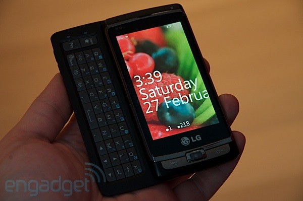
Today, Engadget has shown off the first Windows Phone 7 partner device, from LG, although it is still a prototype. There is little details on the actual hardware, but they have posted a quick video and some pictures.


Previous Next  

4 user comments

11.3.2010 14:57

Isn't it crazy that they made the font so big that they couldn't even fit the whole name of the month on there with out it being cut off.

Yeah maybe the screen moves side to side but why not make it fit on the main screen?

21.3.2010 20:15

Well honestly, once you see the first 3 letters you should know what month it is lol

31.3.2010 23:00

Originally posted by DVDBack23:
Well honestly, once you see the first 3 letters you should know what month it is lol
Yeah but it still looks like they don't have their Sh!t together to design something to fit on the first page of the screen.

And if they wanted me to be able to tell by the first 3 letters of the month then put it on there that way. It probably would have looked better.

427.3.2010 00:25
Pugface
Unverified new user

Originally posted by ydkjman:
Originally posted by DVDBack23:
Well honestly, once you see the first 3 letters you should know what month it is lol
Yeah but it still looks like they don't have their Sh!t together to design something to fit on the first page of the screen.

And if they wanted me to be able to tell by the first 3 letters of the month then put it on there that way. It probably would have looked better.
The idea about having the words off the screen is to remind the user that there is more content off the screen and to find that with a swipe. They did it on purpose.

Comments have been disabled for this article.

News archive