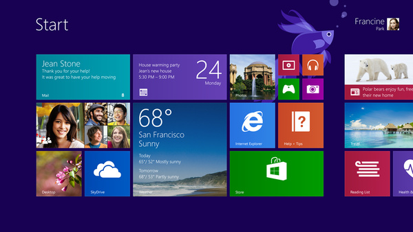
Microsoft has today posted a video showing how some of these changes look. If you are a Windows 8 user then it is definitely worth a watch.

still useless, if you don't have a touch screen monitor.
Originally posted by RottieGrl:agreed, and that start menu, looks familiar, but all he showed was wippy do, bits.
still useless, if you don't have a touch screen monitor.
Just give me back my darn windows button and I'll be happy. Oh, and stop acting like every windows user has a touch screen device. I actually have to use all ten fingers spread over an actual keyboard to type this.
Looks great...similar to my android tablet...I thought they were trying to save their bacon and bring back the start menu? Showing it like this on a touchpad was not gonna help for sure! Unless you are tired of android...Won't get anyone to upgrade from win 7 for sure.
The Start button is back and you did see a little of it in the video, however, it only takes you to the new start screen.
If you really want your start button back download StartIsBack. Probably the best I have tried and at only $3 for 2 PC's it is nearly as good as free. The only thing to watch out for is 3rd party Orb packs ( the start icon ) these can be full of malware so take care if you want to change the Shamrock Orb.
In addition you can just Google Images "StartIsBack orb" and pretty much any jpg with 3 images in a verticle line will work as an Orb.
Wow, it still has that ugly assed start screen.
And you know, the more they shove this crap at me the more I'm even starting to hate that damn Metro Font as well.
I used to like it but it's just too much "design". Gimme a nice Arial or Times or Courier please.
The more they shove this the more people will shove back.
It will be a cold day in hell before I ever put this on something.
I have to agree, ThePastor. The more I see of Win8, the less I like it.
Originally posted by ThePastor:Can't agree more. I'm curious if it is when people say they miss the start button, they aren't really saying they are missing the start menu... I sure do, but bet you do as well.
Wow, it still has that ugly assed start screen.
And you know, the more they shove this crap at me the more I'm even starting to hate that damn Metro Font as well.
I used to like it but it's just too much "design". Gimme a nice Arial or Times or Courier please.
The more they shove this the more people will shove back.
It will be a cold day in hell before I ever put this on something.
Yep, they put the start button back full-time instead of making it auto-hide in the lower left corner as it was before in 8.0. That was probably a good idea to appease all the whiners out there. I'm so glad they didn't creep backwards to a non-full-screen start menu again. Great going Microsoft! Love the easy access All-app screen. I'm hoping it contains desktop apps too, not just the Metro ones.