 Earlier this year, HP and popular menswear designer Michael Bastian announced they would be releasing a smartwatch that could actually be as stylish as a normal watch while still including the ability to get your notifications and other smartwatch features.
The MB Chronowing, which is available now from luxury flash sale site Gilt, is the culmination of the efforts of the designer and the tech giant, and we have been testing the watch for about a week now.
Read on to see whether the MB Chronowing is the first smartwatch worthy of investing in.
This review will be different than our past hardware tech reviews, for the simple fact that the MB Chronowing is more of a fashion accessory than a piece of tech. There's no specs to speak of, and no touch screen. There's no mic, no speakers and there are physical buttons to take care of your dashboard needs.
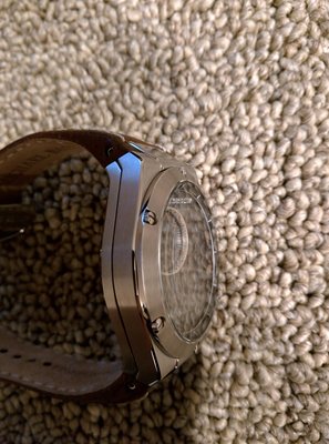
In fact, the only way you can even tell the watch is a piece of tech from a far, is the back of the device, which has a proprietary charging port that allows you to charge the device via USB.
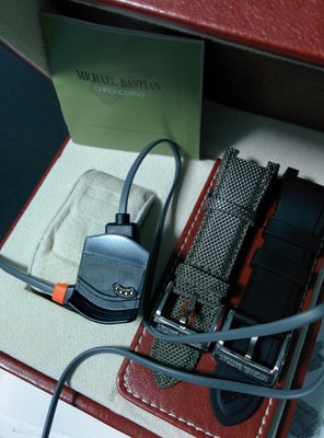
From a style standpoint, the smartwatch is incredibly nice and puts all current smartwatches to shame (yes, including the Moto 360 and the Apple Watch). The watch is stainless steel, 44mm, and comes with three bands. A brown leather, a black rubber, and an olive nylon. All three are easily replaceable with the tools provided in the box, and I found the rubber to be the most comfortable, although the leather is easily the most stylish.
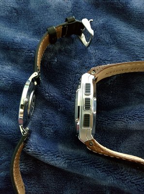
The watch itself, is huge. It's heavy and thick, but that is part of the appeal. It's a sturdy, quality made watch - unlike most Android and Sony smartwatches I've tried in the past. There are three buttons the side of the steel watch face that allow you to control all the smart features of the device. The buttons do not protrude as you would expect, but they are visible from a front view. The caseback has Michael Bastian's signature stamped in next to the charging port. One problem I have found with the watch, especially when wearing with a suit, is that it is simply so thick that it does not fit under a fitted shirt. This can be a problem, of course, if you are trying to wear the watch subtly.
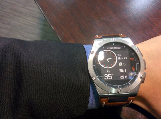
In the watch face, there is a smaller circular traditional watch face and the rest of the face shows your dashboard display. Standard are the weather, the date, and three notifications of your choosing. Alarms/Calendar, texts and emails have been a mainstay on my Chronowing all week. Printed to the face in light orange are a battery indicator and a Bluetooth indicator. When disconnected from Bluetooth, a small dot will flash next to the indicator and the same will occur when your battery is low.
Overall, the watch has slid right into my collection of traditional watches, and honestly even surpasses quite a few of them in style. The Chronowing can be worn in a professional environment, and fits right into your casual dress, as well. Outside of the issue of the watch not fitting under slimmer fitting shirts, it can still be worn with most combinations of clothes. In just the last week, the watch has been an attention grabber for its style, and an even bigger attention grabber when I mentioned I could actually check more than the time.
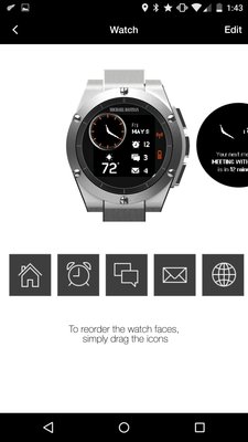
As previously noted, this watch does not use Android Wear, Apple Watch, Sony SmartWatch, Pebble, Tizen, or any other better known operating system. The MB Chronowing uses a proprietary HP-built OS with no bells or whistles. The LCD screen displays the day and date, the weather (if you like that, which I certainly did) and three other notification types, which I kept as the default calendar/alarms, messages and emails. The next pages of the dashboard allow you to see the time, 4 of you favorite stocks, a more complete weather, a remote for your music app (iTunes, Google Music, etc) and finally a smartwatch. All of the functions of the watch are controlled via the free application on your mobile device and then on the watch using the three buttons.
When a message or an email comes in, the watch vibrates to notify you and you can glance over to see the first line of the actual message. Unlike other smartwatches, there is no way to respond, but in all reality, that is what your phone is for and watches are still a long ways away from being usable as full devices (even with included mics). The buttons allow you to scroll through multiple messages (or multiple stocks, weather locations) and generally, your phone stays in your pocket throughout the day more often than it would if you were not wearing the watch. There seems like there are only a small amount of functions to the watch, but in all reality there is a lot. Being able to get the weather, a stock quote, the time and all your unread messages or emails in one place with the tap of a button or two is quite functional, and enjoyed the added luxury while wearing the watch. I did find one inconvenience with the notification system, and that was MMS. Group chats within Android simply did not show up on the Chronowing. I do not know if that will be fixed in coming updates.
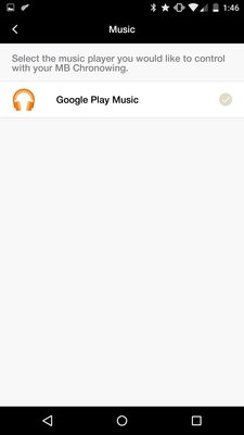
HP says the device will sync with any iPhone 4S or better and any Android device running 4.3 or better. I synced it to the Nexus 5 and Nexus 6 running Android 5.0 and both worked without a hitch. Pairing was simple and the Chronowing app made it easy to edit the different watchfaces. For example, selecting weather locations as "favorites" can be done right from the app, as can your four favorite stocks. You can choose the order of the watchfaces, as well, with a simple drag-and-drop screen. Most importantly, you get to select which apps you will get notifications from. When I first started using the watch, I left everything on as a test and it was brutal. Every push notification, every message, every Android system notification (your phone is at 15 percent battery, battery saver mode turned on, etc, etc), all of it. The app makes it easy to curate, and now we are down to the defaults, Google Voice, Hangouts and of course, Fantasy Football for the time being, giving my wrist a break throughout the day.
Overall, the experience of the application and the actual watch is very satisfying and relaxing, despite its lack of a heart rate monitor, step counter, mic and speaker.
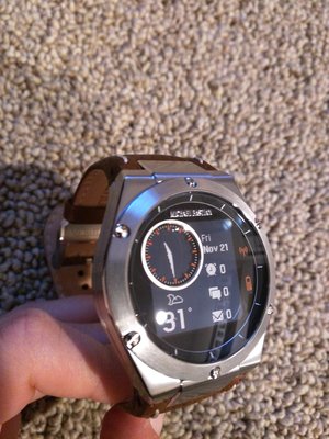
It is hard to judge performance for the Chronowing, well, because there aren't really any standard tech specs. The watch itself has run nicely since I first put it on, and the watchfaces perform as they are supposed to (minus the MMS). Stocks update timely, as does the weather. The buttons are responsive, if not immediate but I never felt the need to have to press overly hard or keep pressing the buttons to make sure the device was listening.
The LCD screen is bright enough to read the time usually, but I did find I was using the built in backlight (press A button for 2 seconds) more often than I would have liked to when I was in lower-light situations. This is in line with traditional watches, however, so there really cannot be any complaints about it.
Battery life, compared to other smartwatches, is a dream. I have been using the watch for 6 days now and am coming up on 10 percent battery life remaining as we write. HP promised a week, and they seem to have delivered. By comparison, the Apple Watch promises up to two days, Android Wear OEM's promise at most up to 2 days, and the Pebble lasted three days with minimal use. Not having to charge your watch in every night along side your phone is a relief and a gift.
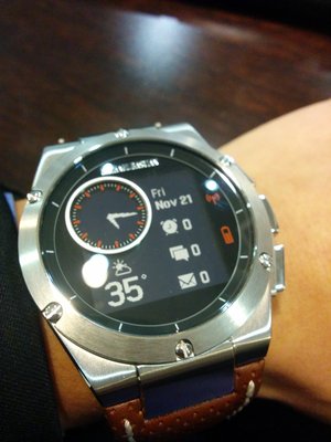
Depending on your needs as a smartwatch enthusiast, this watch is either not what you want at all or exactly what you want. For this writer, the MB Chronowing falls squarely in the latter category. An attention grabbing watch that is not gimmicky, the Chronowing can actually work with a suit and still provide the benefits of seeing important notices with a quick glance to your wrist. The design is stylish, and the price is right if looking for a solid watch with the added benefits of being a smartwatch. At $349 it is priced competitively with the higher-end devices out now like the Moto 360 and Apple Watch. Unlike every other smartwatch I have tried in the past, this one will be added to the collection permanently.
Read on to see whether the MB Chronowing is the first smartwatch worthy of investing in.
Style

This review will be different than our past hardware tech reviews, for the simple fact that the MB Chronowing is more of a fashion accessory than a piece of tech. There's no specs to speak of, and no touch screen. There's no mic, no speakers and there are physical buttons to take care of your dashboard needs.
In fact, the only way you can even tell the watch is a piece of tech from a far, is the back of the device, which has a proprietary charging port that allows you to charge the device via USB.
From a style standpoint, the smartwatch is incredibly nice and puts all current smartwatches to shame (yes, including the Moto 360 and the Apple Watch). The watch is stainless steel, 44mm, and comes with three bands. A brown leather, a black rubber, and an olive nylon. All three are easily replaceable with the tools provided in the box, and I found the rubber to be the most comfortable, although the leather is easily the most stylish.

The watch itself, is huge. It's heavy and thick, but that is part of the appeal. It's a sturdy, quality made watch - unlike most Android and Sony smartwatches I've tried in the past. There are three buttons the side of the steel watch face that allow you to control all the smart features of the device. The buttons do not protrude as you would expect, but they are visible from a front view. The caseback has Michael Bastian's signature stamped in next to the charging port. One problem I have found with the watch, especially when wearing with a suit, is that it is simply so thick that it does not fit under a fitted shirt. This can be a problem, of course, if you are trying to wear the watch subtly.
In the watch face, there is a smaller circular traditional watch face and the rest of the face shows your dashboard display. Standard are the weather, the date, and three notifications of your choosing. Alarms/Calendar, texts and emails have been a mainstay on my Chronowing all week. Printed to the face in light orange are a battery indicator and a Bluetooth indicator. When disconnected from Bluetooth, a small dot will flash next to the indicator and the same will occur when your battery is low.
Overall, the watch has slid right into my collection of traditional watches, and honestly even surpasses quite a few of them in style. The Chronowing can be worn in a professional environment, and fits right into your casual dress, as well. Outside of the issue of the watch not fitting under slimmer fitting shirts, it can still be worn with most combinations of clothes. In just the last week, the watch has been an attention grabber for its style, and an even bigger attention grabber when I mentioned I could actually check more than the time.


Software

As previously noted, this watch does not use Android Wear, Apple Watch, Sony SmartWatch, Pebble, Tizen, or any other better known operating system. The MB Chronowing uses a proprietary HP-built OS with no bells or whistles. The LCD screen displays the day and date, the weather (if you like that, which I certainly did) and three other notification types, which I kept as the default calendar/alarms, messages and emails. The next pages of the dashboard allow you to see the time, 4 of you favorite stocks, a more complete weather, a remote for your music app (iTunes, Google Music, etc) and finally a smartwatch. All of the functions of the watch are controlled via the free application on your mobile device and then on the watch using the three buttons.
When a message or an email comes in, the watch vibrates to notify you and you can glance over to see the first line of the actual message. Unlike other smartwatches, there is no way to respond, but in all reality, that is what your phone is for and watches are still a long ways away from being usable as full devices (even with included mics). The buttons allow you to scroll through multiple messages (or multiple stocks, weather locations) and generally, your phone stays in your pocket throughout the day more often than it would if you were not wearing the watch. There seems like there are only a small amount of functions to the watch, but in all reality there is a lot. Being able to get the weather, a stock quote, the time and all your unread messages or emails in one place with the tap of a button or two is quite functional, and enjoyed the added luxury while wearing the watch. I did find one inconvenience with the notification system, and that was MMS. Group chats within Android simply did not show up on the Chronowing. I do not know if that will be fixed in coming updates.

HP says the device will sync with any iPhone 4S or better and any Android device running 4.3 or better. I synced it to the Nexus 5 and Nexus 6 running Android 5.0 and both worked without a hitch. Pairing was simple and the Chronowing app made it easy to edit the different watchfaces. For example, selecting weather locations as "favorites" can be done right from the app, as can your four favorite stocks. You can choose the order of the watchfaces, as well, with a simple drag-and-drop screen. Most importantly, you get to select which apps you will get notifications from. When I first started using the watch, I left everything on as a test and it was brutal. Every push notification, every message, every Android system notification (your phone is at 15 percent battery, battery saver mode turned on, etc, etc), all of it. The app makes it easy to curate, and now we are down to the defaults, Google Voice, Hangouts and of course, Fantasy Football for the time being, giving my wrist a break throughout the day.
Overall, the experience of the application and the actual watch is very satisfying and relaxing, despite its lack of a heart rate monitor, step counter, mic and speaker.
Performance

It is hard to judge performance for the Chronowing, well, because there aren't really any standard tech specs. The watch itself has run nicely since I first put it on, and the watchfaces perform as they are supposed to (minus the MMS). Stocks update timely, as does the weather. The buttons are responsive, if not immediate but I never felt the need to have to press overly hard or keep pressing the buttons to make sure the device was listening.
The LCD screen is bright enough to read the time usually, but I did find I was using the built in backlight (press A button for 2 seconds) more often than I would have liked to when I was in lower-light situations. This is in line with traditional watches, however, so there really cannot be any complaints about it.
Battery life, compared to other smartwatches, is a dream. I have been using the watch for 6 days now and am coming up on 10 percent battery life remaining as we write. HP promised a week, and they seem to have delivered. By comparison, the Apple Watch promises up to two days, Android Wear OEM's promise at most up to 2 days, and the Pebble lasted three days with minimal use. Not having to charge your watch in every night along side your phone is a relief and a gift.
Conclusion

Depending on your needs as a smartwatch enthusiast, this watch is either not what you want at all or exactly what you want. For this writer, the MB Chronowing falls squarely in the latter category. An attention grabbing watch that is not gimmicky, the Chronowing can actually work with a suit and still provide the benefits of seeing important notices with a quick glance to your wrist. The design is stylish, and the price is right if looking for a solid watch with the added benefits of being a smartwatch. At $349 it is priced competitively with the higher-end devices out now like the Moto 360 and Apple Watch. Unlike every other smartwatch I have tried in the past, this one will be added to the collection permanently.


