
Google also decided this was the year that Nexus would become more than just a techie's dream phone, and struck deals with all the major U.S. carriers for retail launches of the device. In the past, only one or two of the majors every received or marketed a Nexus phone.
Today, we review the T-Mobile GSM version of the phone, as the carrier was the first to launch the handset in the U.S., even after a minor delay.
Specs, Performance and Design
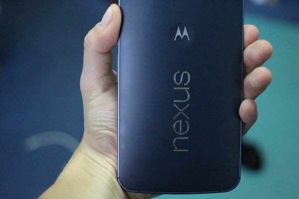
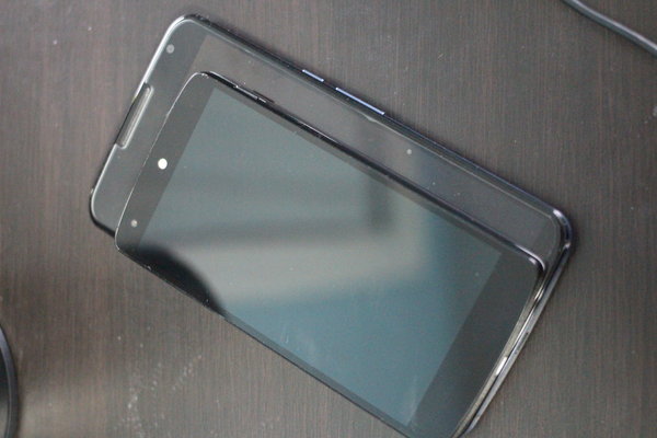
The Nexus 6 is built by Motorola, and the device steals most of its design cues from the 2014 model of the Moto X. Besides the tiny bezel display, the device features dual front-facing speakers, a curved back, plastic edges (with a brushed metal finish) and a slightly recessed camera right in the center of the back plate.
At 6.27 inches tall, 3.15 inches wide, and with a depth of 3.8mm at its thinnest and 10.1mm at its thickest, the phone is a giant yet it still feels evenly distributed. There has never really been a point where I've felt like the device is going to fall out of my hand. At 6.49 ounces, the device is not necessarily light, but for its size it does not feel heavy, even with single-handed use.
Powering the Android 5.0 Lollipop phablet is a 2.7GHz Qualcomm Snapdragon 805 with quad-core CPU (APQ 8084-AB) an Adreno 420 GPU, 3GB RAM, 32GB or 64GB of internal storage, a large 3220 mAh battery and support for basically every band you can imagine. In addition, the Nexus 6 has Qi Wireless charging support, is water resistant, has dual 2MP/13MP cameras (more on those later), standard Micro USB and 3.5mm headset jacks, Bluetooth version 4.1 LE and NFC support. Every component in the Nexus 6 is high-end and you can certainly feel it with everyday use. The power and volume rockers have been moved to the center right of the phone, which is really the only reasonable place to put them with such a huge display.
The dual stereo speakers are a nice upgrade, and on par with the best in breed HTC One M8. Audio is clear and loud and voice call quality is excellent, as well.
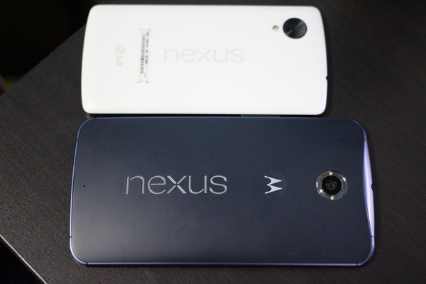
There has been much ado about using the device with one hand and even more ado about keeping the phone in your pocket without it looking silly. I'll be frank here. I do not have large hands (they are rather average) and I did have stuggles with one-handed use, although nowhere near the issues most critics seem to have. If you hold the phone closer towards the bottom third, you can still hold it comfortably and use the device comfortably with just one hand without the fear of dropping it. Now, this does come with a caveat. To be able to properly type one handed you have to use the built in slide-to-type feature of the Android keyboard. iPhone users may have just gotten the luxury of slide typing, but Android users should be familiar and efficient with it at this point. Of course, the phone is obviously much more efficient with two hands as it does feel unnatural to slide all the way to the top right of a 6 inch screen and then all the way down to the bottom left. Thumbs just aren't used to it. As far as two-handed usage goes, the phone is completely built for it, and it feels great thanks to the large width of the device. As far as sticking the phone in your pocket, keeping it in the front pocket of dress pants and slim fit pants gave me no issues although the outline of the phone is normally visible. Placing it in a jacket pocket, even deeper ones, did scare me as the phone always felt too big to stay secure in one place. This was a downside for sure. The phone was so big I felt the need to always have it within grasp unless it was in my pants pocket. Of note, the plastic back does seem to attract grease prints with relative ease. It is easy to clean, and unnoticeable if you have a case (obviously).
If it wasn't clear from before, the performance of the Nexus 6 is snappy, to say the least. I have not seen any noticeable lag, even with 10 apps running simultaneously. In fact, the only time I have seen lag at all is when opening the app switcher/multitask button when I had an excessive amount of Google searches, apps and group chats open or scrolling through Google Now while it tried to update.
Display
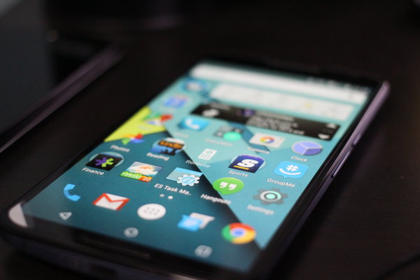
The AMOLED display shines, and at 6 inches with a 1440x2560 resolution, the ppi is a massive 493. The pixel density is on par with the iPhone 6 Plus and the Galaxy Note 4, but the human eye really cannot find the pixels on any of the devices, even if you are looking desperately for them.
Most AMOLED screens have issues with oversaturation of colors, but I did not have this issue with the Nexus 6. The whites were white, the blacks were black and every color in between appeared as it should, with the nitpicking exception that the blues seem a tad dim on occasion.
Google and Motorola basically built this phone around the screen, so it makes sense that it is its crowning feature. Having a large screen with a large resolution makes nearly everything you would do with a smartphone easier. General typing, widgets, reading, movie watching, sharing pictures and navigation are all much improved on the large screen and leaves much less strain on the eyes. Web browsing, especially, is a joy on the Nexus 6 as mobile and even desktop versions of sites all read easily. Not having to strain to read websites is not something you think about with a smaller screen but it is a huge relief once you've tried a phablet. Coming from the 5-inch Nexus 5, I didn't think the extra 1 inch of real estate would make a huge difference but it does. It makes a huge difference and it's all positive.
Having moved to such a beautiful, large display, I can't imagine ever downsizing in the future.
Cameras

The Nexus 6 is Google's first attempt to make a Nexus camera relevant. Every past Nexus device has featured a mediocre camera that had you asking your friends and family with an iPhone if they could take the nice shots when you are out.
This is now a thing of the past. The Nexus 6 features a 13 MP IMX 214 Image Sensor with f / 2.0 aperture, Optical Image Stabilization, Ring flash with dual LEDs, 4X digital zoom, HDR+ and the now Android standard Panorama, PhotoSphere and Lens Blur modes.
With the updated sensor, the Nexus 6 offers sharp and crisp photos with good colors (especially in HDR+ mode). In good lighting, I would say the camera can even compare to older generation iPhones, like the 5 and 5S. The fact that the Nexus 6 offers the best camera yet seen on a Nexus phone is a great step in the right direction but there is more work to do and it had very little to compare to as past models all failed. Low light shots were also a major improvement, thanks to the manual focus and internal lighting mechanism, but those too could use work.
Here are some shots taken including the header:
Battery Life
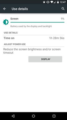
In this writer's opinion, the battery life is the single most "killer" feature of the phablet. Coming from devices that barely got through the 9-hour work day even with minimal use, the Nexus 6 and its massive battery are a huge relief. I have averaged 18-24 hours at minimum with very heavy use, and over 30 hours with minimal use (Wi-Fi turned off, etc).
The Nexus 6 gives me a phone that I do not have to worry about running out of battery in the normal course of a day, and one that I do not have to even worry about if I fall asleep and forget to place it on the charger. The Moto Turbo Charger can fill the battery up in around 2 hours, and can give you a few extra hours of "juice" in just 15 minutes of charging.
In addition, Android has finally added a true battery saver mode to the operating system, which you can choose to activate when the battery reaches a certain point. I chose 15 percent and with closing background data and shutting down other features, the saver mode really does extend your life significantly while not drastically killing performance. I have been actively trying to run down the battery today ahead of the publishing of the review, and after 15 hours the Nexus 6 sits at 21 percent. It's pretty fantastic.
Software and Ecosystem
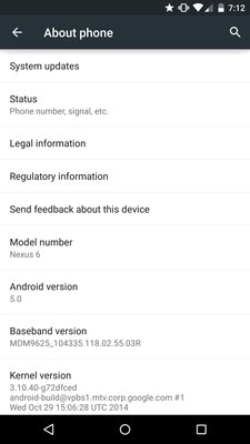
This review would not be complete without a mini-review of Android 5.0 Lollipop, the operating system for which the Nexus 6 was chosen to showcase and bring to the masses.
Based on the new "Material Design" concept, Lollipop is the biggest visual rebuild for the operating system since the Ice Cream Sandwich update in 2012. Moving from the dark theme of Android 4.x, Material Design is bright, colorful and overall more exciting than past Android versions. Texting different people brings different color bubbles ranging from bright pink, to bright orange and forest green and teal. Group chats help you easily distinguish who is talking with different color bubbles for each person speaking.
Taking cues from Google Now, the new OS is based on "cards" and an excellent new set of features. Notifications are the biggest benefactor of the new OS, especially now that you can actually see and open them right from the lock screen or right from whatever app you have open. By double tapping the notification, you can enter right into your texts, email client, instant messaging app and more. This is a subtle, yet huge upgrade. Motorola has even added in its own "Ambient Display," which shows the unread notifications in dimmed light with everything else black, saving battery life and keeping only what is relevant on the screen for you when you get close enough to the screen to activate the mode. There are additional privacy settings, as well, meaning you can see that a text came in but choose to have that message unreadable until your password is entered. You can also send notifications away with simple gestures, right from the lock screen.
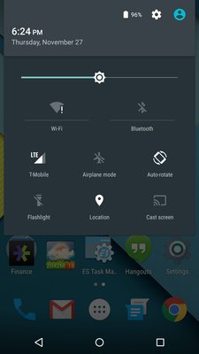
The actual dropdown notification bar and taskbar have also been upgraded. Your user profile is right at the top, with the option to create a second user profile or even a guest, so that your private setting and messages don't have to be shared with everyone who may want to use the device. The taskbar has added a flashlight, a cast button (for Chromecast) and made it easier to get to your settings. All the changes are subtle, but work well and make it easier to do what you want to do, quickly.
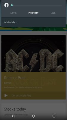
Google also got rid of the traditional "silent" mode, but replaced it with "Priority Mode." When hitting the volume rocker, you have ringer and vibrate and then "All," "None" and "Priority" modes. With All, you receive all your notifications with the accompanying ring or vibration, with none, you get none of them (not even alarms or calendar notices), and with priority, you get to choose what you want to come in. I've found myself keeping alarms and phone calls with vibration on, and priority silence on everything else. It's a nice balance. The modes certainly come in handy in professional environments (or even if you are going to a play/event, etc), as well, where it may not be proper to have your phone vibrating or ringing all day.
Another interesting feature of "material design" is the "compose" options when sending an email or text using the default Gmail and Messages apps. Instead of hitting a small + sign in the top right like previous iterations, you now have a "floating bubble" with a + sign in it at the bottom right to start your new messages. It is somewhat unnecessary, but fits perfectly with the new design of the OS.
Conclusion
Google picked the perfect device to show off its new operating system, and truthfully it picked the perfect device to try to turn Nexus into a mainstream, household name. The Nexus 6 comes at a time when Apple has confirmed that consumers are looking for bigger devices, and they don't get any bigger than the Nexus 6.
The search engine giant has also hit a home run with Android 5.0 Lollipop, which took the relatively bland design of Android 4.x and spiced it up while also adding a plethora of new features designed to keep you more private and more productive.
Of note, Google has not yet worked out the whole "how to release a phone properly" thing yet, and the Nexus 6's rollout has been by most standards, a disaster. Google's own stash sold out in less than 40 seconds, and Motorola's is never in stock for more than minutes at a time. T-Mobile had to delay their launch, and is having supply issues now, as well. The other major carriers don't even have set dates for release yet. With other major releases, you at least know you'll be able to get the device, even if there is a massive backorder. With the Nexus line, it's like throwing a pair of dice and hoping for 7.
At $649 off-contract, the device is not cheap, but with carrier support, it can be had for much cheaper as most now offer some sort of two-year financing options. Previous Nexus devices gained popularity among enthusiasts due to price tags under $400 for unlocked devices. Whether or not the gamble pays off remains to be seen, but my very unscientific survey seems to show that at least some people have heard of the Nexus 6. This was never the case in the past.
Stock Android fans have their dream phone, and maybe soon enough, the rest of America will too.
Design 8/10
Specs 10/10
Performance 10/10
Display 10/10
Software and Ecosystem 9.5/10
Cameras 8/10
Battery Life 9/10 (as compared to other phablets)
Total 9.2/10


