AfterDawn: Tech news

The Windows 8 retail packaging looks great

Written by Andre Yoskowitz @ 06 Aug 2012 7:12 User comments (25)

The Windows 8 retail packaging looks great

Microsoft announced last week that its upcoming Windows 8 operating system had gone RTM, meaning the final product is ready to roll in late October.
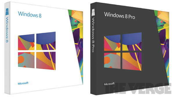
The Verge has gotten a sneak peak at the retail packaging for the upcoming, and frankly, it looks great.

The packaging for Windows 8 and Windows 8 Pro will use Windows 8-style UI packaging and some abstract art that fits the new logo perfectly.

Windows 8 gets a white box, while Pro gets a black one.

All versions of the tablet will be available on October 26th, or now in pirated versions from warez and torrent sites.

Previous Next  

25 user comments

16.8.2012 19:34

yep looks nice and simple

26.8.2012 20:22

Yes just keep the package and throw the contents away.

36.8.2012 23:47

Why in the world would anyone care about the packaging?! "All looks and no substance" has been the bane of OSes for a long time, now, for heavens' sake >.<' ...

47.8.2012 04:41

Typical M1cr0s0ft? Great marketing, crappy software?

57.8.2012 10:30

You mean it looks like something I won a 2nd place ribbon for in the 3rd grade?

67.8.2012 11:01

Originally posted by Qliphah:
You mean it looks like something I won a 2nd place ribbon for in the 3rd grade?
Ya, close if you then have a celebration for your victory and you get milk and cookies only to find out the cookies are stale and the milk has soured :(

77.8.2012 16:23

Quote:
The Windows 8 retail packaging looks great
Slow day for news?

87.8.2012 22:33

ooooo wow look at the pretty box!!! this MUST mean windows 8 is gonna be top dog.
NOT

watch , here is micro0fts, first HUGE epic fail. can you see companys switching over to windows 8. when hundreds of thousands of illeterate pc users who work in companys where they are used to windows 2000, xp,vista,and even 7. and now 8, which for the most part, is a COMPLETE overhaul, and NOTHING at all like a normal windows operating system. it looks more like a smart phone. THIS IS A COMPUTER. hell even apple has stayed smart in the OS updates.

98.8.2012 00:02

Originally posted by 1nsan3:
ooooo wow look at the pretty box!!! this MUST mean windows 8 is gonna be top dog.
NOT

watch , here is micro0fts, first HUGE epic fail. can you see companys switching over to windows 8. when hundreds of thousands of illeterate pc users who work in companys where they are used to windows 2000, xp,vista,and even 7. and now 8, which for the most part, is a COMPLETE overhaul, and NOTHING at all like a normal windows operating system. it looks more like a smart phone. THIS IS A COMPUTER. hell even apple has stayed smart in the OS updates.
first huge epic fail?you must be just a young fella.ME comes to mind,with vista a close second.that having been said,though,they just crapped a big one with windows8.

108.8.2012 02:34

Isn't this just an example of the "lipstick on a pig" saying?

118.8.2012 05:34

Looks like they just slapped some old 90's clipart on there and figured it was good enough.

128.8.2012 11:08
StiX5150
Unverified new user

Yesterday I installed Windows 8 The RTM Version on a separate partition beside Windows 7 on my wife's laptop and see loved it.
The retail packaging does look...Well fresh.
The same can be said for the look and feel of Win 8.
Not having a touchscreen PC myself I was unable to explore that aspect on the new OS, but did put a new spin on the old OS we have all come to know

138.8.2012 12:03

"New" or "fresh" is not necessarily "good". We're not talking about vegetables.

148.8.2012 15:37

You could also spray paint a turd gold but you'd still have a turd on your hands...

158.8.2012 21:25

Originally posted by StiX5150:
Yesterday I installed Windows 8 The RTM Version on a separate partition beside Windows 7 on my wife's laptop and see loved it.
The retail packaging does look...Well fresh.
The same can be said for the look and feel of Win 8.
Not having a touchscreen PC myself I was unable to explore that aspect on the new OS, but did put a new spin on the old OS we have all come to know[/quote

That's exactly what I say. My wife, our 16yr old daughter, and I love windows 8. The UI is not even an issue for my wife who doesn't know much about computers except login in and opening and closing apps. It literally took me 20min for her to learn how to get into the settings and make any changes she desired.
I'm into video editing and I have a small wedding video business and upgrading my win7, self built pc, was easy and painless.
Calling win8 an epic fail, or that it's the worst Windows OS in history is just plain stupid and ignorant comment.

This message has been edited since its posting. Latest edit was made on 08 Aug 2012 @ 9:29

168.8.2012 21:29

Windows 8, Mountain Lion, or Ubuntu 12.10 lts what would you use ?

179.8.2012 02:18

I'm still trying to find 3rd party tools to make Windows 7 less aggravating. Ever since Vista, Bing and Office 2007, Microsoft seems to like making their software second guess what you want to do in the name of 'user-friendliness'...and it sucks!

189.8.2012 15:42

Originally posted by xnonsuchx:
I'm still trying to find 3rd party tools to make Windows 7 less aggravating. Ever since Vista, Bing and Office 2007, Microsoft seems to like making their software second guess what you want to do in the name of 'user-friendliness'...and it sucks!
It's called UAC, just do a search and disable it from the control panel, if you didn't know that already. As for Office, there are custom made themes you can get that will revert some of the looks back to Office 2k/XP, btw the keyboard commands are all the same if you ever learned them. As for Bing.... don't use it, enjoy google while it lasts.

1910.8.2012 04:02

Still selling hard copies.
Very progressive.

2010.8.2012 08:01

Google "ubit menu". It adds a "Menu" tab to Office '07 and later, that contains the entire old interface from older versions, that doesn't interfere with the new interface at all. It's legally free to private users, as well.

This message has been edited since its posting. Latest edit was made on 10 Aug 2012 @ 8:02

2110.8.2012 14:08

I really hope Win8 succeeds. I currently have installed the RC version on my laptop and I hate it. I also hated Office 2007 when compared to 2003 (as did everyone) but after using it for a year or so I realized how much better the UI really is. I hope the same happens with Windows8 because it does seem like its not a hacked together OS like Vista and they are releasing it to stay relevant (something blackberry failed to catch on to). I agree that in the professional world Windows8 is pretty much useless but for average users with touchscreen laptops it might end up actually being liked. For all those people complaining about Win8 Metro UI (now called Windows8 UI) I realize change is hard but I think everyone should use it for a year or two before reaching a final conclusion (in case anyone missed it, I currently dislike Win8 but hope my opinion will change in the future).

2210.8.2012 19:07

I completely refuse to use an interface I cannot stand for a year; that defeats the entire purpose of said interface.

The point of a UI is to make the product accessible to the end user, *not* to force the end user to conform to the product.

2311.8.2012 06:40

Hello there, Concerning packaging as whole, I can see that it can be can be seen as boring or simple. I mean, how much can you do to change a box? The answer is, quite a lot. As more and more companies are hiring expensive graphic designers and industrial design experts, the race for more innovative and ultimately more appealing package designs is on. That could be one of the advantage of technology, we can make a lot of innovation to turn a simple box to elegant one and that could also be the advantage of more companies specializing in graphic designing. It's really aesthetic and appealing to ones vision whenever a product is designed well.

This message has been edited since its posting. Latest edit was made on 11 Aug 2012 @ 7:13

2411.8.2012 18:14

There's nothing about this packaging, frankly, that couldn't have been done in the 80s, whether on a computer or by hand. And that misses the main point here: NO ONE CARES about the packaging!

When was the last time you looked at the boxes that any of your software came in? Hell, I don't even keep the disks in their jewel cases, but rather a "disk bible" CD/DVD binder, FFS.

"Lipstick on a pig", indeed.

2511.8.2012 20:48

Originally posted by Bozobub:
There's nothing about this packaging, frankly, that couldn't have been done in the 80s, whether on a computer or by hand. And that misses the main point here: NO ONE CARES about the packaging!

When was the last time you looked at the boxes that any of your software came in? Hell, I don't even keep the disks in their jewel cases, but rather a "disk bible" CD/DVD binder, FFS.

"Lipstick on a pig", indeed.
Actually i think cindyanderson nailed it right on the head with her comments. To focus completely on the box and how pretty it is seems to be all that this issue is about. No longer is it about functionality or anything meaningful, today image is if the image is good, it has to be great. Who cares if win8 is crap or a pain to use as long as it looks nice.

Bozo, it seems it really isn't even about the pig, but... aaahh! what a lovely color lipsh1t on the pig :)
This message has been edited since its posting. Latest edit was made on 11 Aug 2012 @ 8:52

Comments have been disabled for this article.

News archive